Hayfinn Rentals brand identity case study
BRAND IDENTITY + REAL-WORLD APPLICATIONS
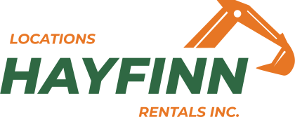
A practical, energetic identity for an equipment rental business, designed to stay recognizable at the counter, on the road, and wherever the work begins.
A rental brand built for work in motion.
Hayfinn needed an identity that could feel capable and approachable while staying easy to recognize in the practical places customers encounter the business.
The result pairs a confident wordmark with a distinctive equipment-inspired symbol and a straightforward colour system made for everyday use.
Built to feel capable, clear, and ready to work.
The identity combines the structure of a roofline with the familiar form of an excavator arm, giving Hayfinn a mark that connects place, equipment, and service in one memorable gesture.
Strong geometry and forward-leaning letterforms create a sense of movement without losing the dependable character a rental business needs.
Recognizable wherever customers meet the business.
The system was carried into the everyday touchpoints that matter most, from information handed across the counter to a vehicle seen across town.
DESIGNED FOR EVERYDAY VISIBILITY
A brand that works from a quick glance.
Clear contrast, simple shapes, and a direct connection to equipment help the identity register quickly. The same core elements can move between small printed details and large-format applications without changing character.
- Clear at a distance
- Flexible across practical formats
- Distinctive without feeling overworked
One clear identity.
Ready for the real world.
Hayfinn now has a focused visual foundation that feels at home on a business card and on the side of a working vehicle. It is recognizable, practical, and ready to support the business as it grows.
READY FOR A BRAND THAT FITS WHERE YOU’RE HEADED?
Let’s build on the business you’ve already created.
Tell me what you value about the business today and what you want customers to understand more clearly.
Start a Conversation →